
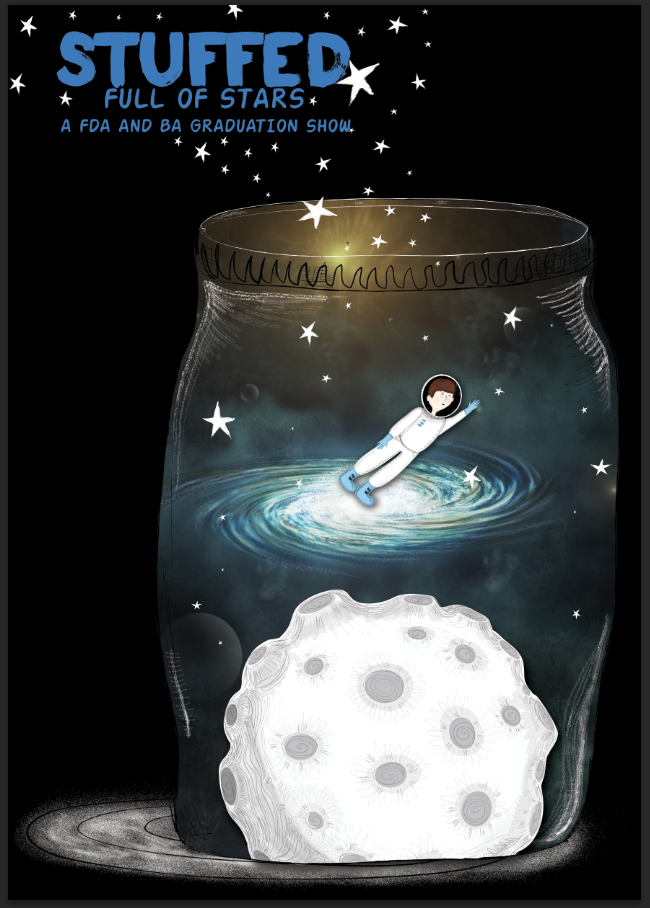
Jake and I both agreed to come up with some poster variations using the various assets that we have produced. We also agreed that we would both do it A1 in size so then it could be resized to any specifications (this was important since we were both using Photoshop to put them together rather than Illustrator). I came up with the variations below - I tried to make it look like the jar was open and releasing all the stars which I did by getting rid of the lid fill and adding in some white outlines to my Illustrator piece before transferring it into Photoshop. I added in a shadow in order to integrate some depth which I made using white brushstrokes which contrasted with the background.
When I first began making the poster I was originally planning to use a white background but I felt that it looked a little bit boring and empty, instead I experimented with black and was much happier with how everything looked. I feel like the black fits in with the space star theme and helps to make all the white elements look brighter.


No comments:
Post a Comment