Wednesday 25 March 2015

Final Submissions And Evaluation

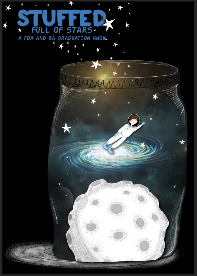
I think that we have worked well on this group project, everyones opinions and perspectives were considered and included, and I think that we have managed to create a response that has carefully balanced everyones visual styles. The idea was that these different jars would represent our imaginations and our creativity and I think this comes across. We wanted to think outside the digital box and this was the idea that stemmed from that. Jake and I created various pieces of artwork that could be animated (Jake focused on the main space background as well as other jar backgrounds. I focused on small characters, planets and jar outlines) Dan tackled the actual movement in order to create the promo (he also provided some jar backgrounds as well) and was in charge of choosing the typography. Jake and I then used our elements to generate two different poster designs that we we felt complimented each other but were also different enough to provide some variety. I think that my poster would probably work better on a smaller scale and Jakes would work better on a larger one but neither of us were constrained by size. I am very proud of what we have produced I think we did well considering the shorter turn around. The branding we have generated is fun and successfully alludes to creativity. It was nice to be able to rely on others during this project which helped to lessen the load and I found that because we had a clear starting idea there weren't really any conflicting design issues. Overall everything went well and we have produced some interesting and hopefully engaging brand designs.


My Poster

Jake's Poster


Dan's Final Animation
             

Tuesday 24 March 2015

Poster Variations...

Jake and I both agreed to come up with some poster variations using the various assets that we have produced. We also agreed that we would both do it A1 in size so then it could be resized to any specifications (this was important since we were both using Photoshop to put them together rather than Illustrator). I came up with the variations below - I tried to make it look like the jar was open and releasing all the stars which I did by getting rid of the lid fill and adding in some white outlines to my Illustrator piece before transferring it into Photoshop. I added in a shadow in order to integrate some depth which I made using white brushstrokes which contrasted with the background. 

When I first began making the poster I was originally planning to use a white background but I felt that it looked a little bit boring and empty, instead I experimented with black and was much happier with how everything looked. I feel like the black fits in with the space star theme and helps to make all the white elements look brighter.  


 Dan suggested placing it on one of my orange backgrounds but I felt like this was far too bright and contrasted too vibrantly to work effectively.
 Since Dan used pink on his type I integrated the same colour which I think is a bright touch on the black and works well in drawing the eye.
So far I am happy with how the poster looks I think it has integrated my style with Jakes pretty well!

Motion Stuff

This is what Dan has managed to animate so far as our promo video- I think it looks really cool, theres a lot of fun with the perspective and I think it all seems to work together pretty well, having said this Jake and I both felt that some small tweaks were necessary and Dan was willing to oblige. The zoom needs to go on for longer and the camera needs to stay on the jars for a second more at the end which will allow the audience to fully understand and absorb the whole scene. More small movements in the other jars is need especially on the left side of the main jar, glowing eyes blink on the right and the space man slowly moves but I think some smaller movements are needed to make it a bit more dynamic and visually interesting. It was also suggested that the moon spin in the space jar and that Dan's caterpillar could be swapped for another element that Jake and I could provide just because visually its not as in keeping as the rest of the stuff is. So far though our idea has been captured it just needs a little bit of tweaking.

Monday 23 March 2015

Jar Backgrounds

I created some additional backgrounds to go into some of the spare jars in order to ensure overall continuity within the design. I knew that Jake and Dan had created some darker ones so I opted to create some bright ones- I used a lot of pink hues in order to tie in the type colour choice that Dan presented. The backgrounds would also need to be animated a little - so the stars in the one below can spin. 


The rain can fall.
The candle can flicker on and off again.
I ended up using a mix of photoshop and illustrator to create these and I am very happy with the brushes that Jake has given me to use - they are incredibly textural and allow me to create almost paint effects. 

Typography Choices

I didn't have much to do with picking a font we all pretty much determined that something with some kind of brush effect would probably look best. We delegated the typography to Dan since he was a better judge in this area. He presented the two fonts below, the first one as a slogan/smaller written details font and the latter as the main name font. They work well together and they definitely contain a brush element so they should work effectively in our design.


Mock Up Stuff- Visual Concept Clarification

Jake finished his space background and sent it to both me and Dan, so whilst Dan cracked on with the motion stuff and Jake created some more subtle backgrounds to go in some of the other jars I attempted to put all of the elements together in order to check that everything would gel together. I am really happy with how it all looks (Jakes work is phenomenal) and I think it will look brilliant when it is placed into motion. Now we just need to figure out how and where to place the name on the posters and what exactly we are going to place on them. Currently I'm operating under the assumption the big A1 poster is going to contain lots of jars and the smaller version just our main jar. Potentially the name could be placed on a jar label at the top.


The Jars

In the end I also got delegated the jars to draw because - Jake was creating backgrounds for more jars as well as the main one and Dan was trying to make all the elements move (both hefty jobs). It was suggested that because we wanted to keep the background simple that simple shelves be created and in order to create these, jars were needed mostly to provide a sense of height and scale. I tried to keep the jars very off balance like the ones previously researched and different in order to ensure a variety. I ended up creating three basic jar shapes and then distorting them to various widths and sizes to create the impression that the jars were very different. I also kept the background very very light - a slight wishy washy shading since I knew that Dan was planning to apply some kind of paper texture. I also made sure that a large jar was place centrally in order to offset our main space scene.


The Moon

I was also tasked to create a moon so I created this one below- I wanted it to look really illustrative since I felt that it would help to offset my astronauts style. In order to try and give it a sense of light and dark I also integrated a bottom shadow using a darker tone which I think helps to give it a sense of weight (even if it is a more illustrative styling). So far really happy! 


Astronaut Designs

I drew out a variety of astronauts until I found the right one that I knew would fit. Though I had a style in mind for them in general I found that when drawing them that there were elements that didnt work. 

Astronaut 1
 I didn't like the squareness of astronaut 1, I had issues with both the eyes and the nose and I feel like the character looks too old - I think it will look better if the face is rounder and therefore softer and if the eyes were the more basic dot eyes.
Astronaut 2


Though I didn't mind astronaut 2 I feel like that his face is now too rounded- although I prefer the eyes and nose in this one - there was something that still wasn't right with it. 

 Astronaut 3


I am much happier with astronaut 3 - although he is a little paler than intended - this will be fixed with the lighting.  His face is much younger which I think works better with our jar space idea and I'm happier with his pose since it looks like he's reaching for a star and trying to fly through space.


Sketches

Before doing anything digitally I quickly mocked up some astronauts and our concept with the jar. Dan and Jake were both happy to let me draw out the astronaut based on the sketches that I made below and were also happy to let me draw out the moon base since it would help to disperse my illustration with Jakes background and create a cohesive piece. 


 Im not sure which is going to work better - big normal eyes or small dot eyes- so I intend to test out both.

Textural Mixing Inspiration- Oliver Jeffers

I was a little concerned with how my drawings and Jakes drawings would gel together- his work is so detailed and very realistic looking - it also has this beautiful sense of scale to it (which I have no idea how to achieve!) though I could do a more realistic astronaut character I felt like it would then still look odd next to Jakes backgrounds or possibly blend in. Since I was going for a more adult but still cartoony style I wanted to see how other illustrators has mixed more real illustrative elements with less realistically styled characters. I cane across Oliver Jeffers work and felt that it managed to cohesively present two very different styles together.


In the work above the moose and the boy are highly illustrative but the background has a more realistic appearance. Despite this, the two elements really work together. I think this is down to the texture that has been applied to all of it, the sense of light and shadow which also helps to texturally soften the image and the use of subtle illustrative cartoon in some other elements (the river reflections and ripple lines are a prime example of this). I definitely feel like the typography also helps to make it into a cohesive piece and I think texture and light are all elements that we should consider to ensure a well made final result.


The book cover above has the same use of real with illustrative and again this is down to the texture, lighting and careful integration of illustrative elements. The stars in particular help to disperse the more cartoony illustrative style on the realistic backdrop, as does the soft texture of the yellow straw. I also love the sense of shadow which really help to give the design perspective which again I think we should include in our design.

Graduation Show Posters - Inspiration

Whilst we add a clear direction we did feel it necessary to at least consider other graduation show posters and designs in order to clarify our ideas. Since we were going with a space theme I remembered from my previous research that one graduation show utilised this aspect. Although our idea (combining the space scene with jars) was a little different we did like the wishy washy elements that had been integrated into this poster and were particularly inspired by the composition of the scene. The notion that there could be foreground and background elements that our promotional video could accentuate by zooming through them all. From a more practical perspective I could definitely see how Jakes work could really look stunning if we included some kind of background which is really his forte so we opted to find a way to display all of this as well.

Wednesday 18 March 2015

Typography Research

Dan wanted to have the text write itself in as a part of the promo and we always knew that we would need text elements - we began to visually gather some inspiring font based images.

I liked the various fonts in this bottle - it seemed to be both very clean and yet nuanced like hand-drawn writing.
 I love the roughness of the font below I think it perfectly accents the starry background and it is definitely something that I think will work well with the jars. I think because we are integrating jars there has to be a rustic roughness to them that this font very much embodies.


Additional Key Visual Research

Before designing my astronaut character I did a bit of visual research, I really love the sketchbook image of all the jars below it reminds me a little bit of Quentin Blakes sketches. I like the pencil texture and I fully intend to try and incorporate some into my own astronaut design.

Briony May Smith
 I thought that this gif was really clever - and again it was one of the few jar related illustrations that I could find. I like the colours and the mix of real style space images with the more cartoony jar. I also think the integration of the label is a nice idea that we could potentially steal.

Felicita Sala

Since I was drawing an astronaut it felt prudent to look into other astronaut illustrations, Felicita Sala's sketches were ones that I particularly admired- and I really enjoyed the simplicity to the characters- although there are elements of detail the general softness to the characters keeps them nice and bold. There is also a certain cleanliness to the sketches I would like to include since it will help when he is placed onto Jakes background.


 The jar below is another favourite of mine- I love the distorted perspective and the general quirkiness of the jar itself its filled with a some lovely textures. And I think that this same distortion could be applied to our design as it will help generate some various points of interest amongst the shelves.

Name Ideas

Although we didn't necessarily need a name slogan or theme we felt that we should come up with one for the sake of unifying our branding. Once again we opted to go with something that didn't relate to digital design at all. We wanted a one word catchy name. Initially we couldn't think of much but after some pondering and a conversation with my mum I came up with the name stuffed.

Stuffed - seemed appropriate in regards to both the idea and to us as individuals, I liked the idea that the jars were stuffed full of creativity and fun, that we as designers are stuffed full of talent and that because are course is coming to an end we are stuffed because we now have to be adults and get real life jobs.

I pitched the name to the other two and they also seemed to enjoy it! After this I then came up with some slogan variations:

Stuffed: Full of Stars

Stuffed: Jars full of stars

Although Jake was happy with it Dan didn't think we needed a slogan- since I disagree and think this adds some fun and links the idea together with us- we are design stars after all- I intend to convince him otherwise!

Mood Boards- Inspiration Research

It was decided that I would create a more flat and hand-drawn style whilst Jake would create slightly more wishy washy space backgrounds. Utilising key textures would hopefully gel our works together. Below are some of the pieces of work that we all found particularly inspiring, Felicita Sala was one artist in particular whose characters fitted what I would ideally create her black and white pencil drawings in particular were the most inspiring. The jar artwork was harder to come by but there were a few examples that we could draw on for visual support.


Initial Group Ideas

Before we could decide on a concept we opted to look into various design styles. Establish what each of us would input and what we could make was imperative especially in view of the lack of time available for this project. Since it was such a fast turn around we established that we would need to integrate all of our styles and in order to do that we needed a concept that would suit all of us. We all threw around some ideas and came up with the following branding ideas:
Space,
Sandcastles
Galaxies
Stars
Jars
Quirky
Monochrome
Ink 
Pen 
Strokes/Brushes

We ended up linking some of these ideas together, Dan suggested creating little worlds, and we eventually ended up with the idea to place some kind of illustrative scene (that Jake and I could collaborate on) to put within a jar. Jake then came up with the idea that we could have many many shelves of jars (although our A1 and A3 posters would be of one specific jar) each filled with various little mini scenes which would represent the ideas of creativity and imagination. We all wanted to think a bit outside the box so we were happy to develop this idea.

Eventually we settled on creating a little space scene since it was Jakes speciality and Dan and I both thought that it would look visually intriguing if we were able to light up the jar with glowing stars. After we settled on this we established that I would draw out the astronaut character whilst jake would deal with drawing the space/galaxy background. 

For the Video/Promo:
Dan felt that using the illustrations we produce and zooming through them would make for a more interesting promo than filming something entirely new. 


Tuesday 17 March 2015

The brief

The Brief

This brief is intended for end of year show preparation. Working in teams of at least 3 people you will devise an identity to work on all media/signage, an A3 poster design, an A4 poster design and a 30 sec promo video. The show must be called FdA & BA (hons) Digital Media Design Graduation Show (rather than a name or theme).

You should decide in your team what the roles are, making sure that each person has equal responsibilities. You must make sure that each person takes part in the project. You should all log your individual roles, responsibilities and progress on your blogs.

We were allowed to choose our own groups so I ended up in a group with Dan Mole and Jake Guest- Dan has agreed to handle the video stuff and Jake and I are very enthusiastic about collaborating together to produce some kind of base design for the posters (and video).